
👋 Hi, I'm Nathaniel Issayas
Risk Analyst | Compliance Analyst | Data Analyst
💻 Excel, Tableau, SQL, Python, R, C/C++
🏋️ Sports, Fitness, Health
📍 Hercules, CA USA
Technical Skills
Tableau
Power BI
Python
Google Sheets
SQL
Excel
R
C/C++
Data Analytics Projects
🍔 DoorDash Marketing Project
Excel | Exploratory Data Analysis
◾ Real world-marketing campaign data
◾ Using only Excel for analysis and data visualization
◾ Utilized VLOOKUPS, Pivot Tables, Scatter Plots, & Bar Charts
◾ Provided a comprehensive write up to help the marketing team on their next campaign
.

🏫 Evaluating School Success with Tableau Project
Tableau | Data Visualization
◾ Created dashboard evaluating 1,800 different schools' performance across hundreds of features
◾ Used Scatter Plots, KPI's, Bar Plots, & Area charts to show performance differences
◾ Analyzed links between academic performance, college attendance, and economic disadvantage
.

💵 Financial Analysis of World Bank Loans
SQL | Exploratory Data Analysis
◾ Data-mined 1.2M real bank transactions to find financial outliers, patterns, & trends
◾ Used SQL clauses such as SELECT, WHERE, FROM, GROUP BY, AVG, MIN/MAX, SUM, AND, etc
◾ Created written report highlighting findings
.

⛏️ Analyzing Mining Data with Python
Python | Exploratory Data Analysis
◾ Analyzed mining data using Pandas, Matplotlib, and Seaborn libraries
◾ Visualized trends with line plots and pair plots
◾ Cleaned raw data by correcting formats and converting data types with Pandas functions
.

🏥 Analyzing Hospital Data with SQL
SQL | Exploratory Data Analysis
◾ Analyzed what affects hospital stay length in MySQL
◾ Created a histogram using SQL
◾ Real data from over 101,000 hospital patients
.

🏀 Analyzing NBA Data with Tableau
Tableau | Dashboarding
◾ Analyzed the 2022 NBA season statistics
◾ Created Stacked Bar Charts, Heatmaps, Treemaps & Bubble Charts
◾ Built a Tableau story & shared via written report
.

About Me

👋 Hi, I’m Nathaniel, an IT risk and compliance professional with hands-on experience in vendor risk management, policy audits, and data-driven compliance processes. I help organizations identify potential risks, ensure regulatory adherence, and optimize compliance operations through automation and analytics.I’m currently pursuing CompTIA Security+ certification and building foundational expertise in IT risk frameworks and cloud security. My goal is to support organizations in strengthening compliance programs, mitigating risks, and turning data into actionable insights.If you’d like to connect or discuss opportunities in IT Risk, GRC, or cybersecurity, feel free to reach out: [email protected]
🍔 DoorDash Marketing Project with Excel
Overview
The food delivery market has been booming in recent years, and chances are you’ve at least heard of it—even if you’re not a frequent user. The following data was compiled for DoorDash’s marketing team, and it offers some relatable and intriguing insights.Curious where you fall in the stats? Keep reading! We took a deep dive into:- Age brackets
- Relationship status
- Whether or not customers have kids
- Most active months
- Income levels
- Food category preferences
Objective
DoorDash requested an assessment of their sixth marketing campaign’s effectiveness. They also wanted creative suggestions to help boost overall sales on the app.By leveraging pivot tables, visual data, and linear regression, we analyzed spending behaviors across different demographics. We included charts and graphs to make the findings easy to digest.Key takeaways include:• Clear identification of DoorDash’s most loyal customers.
• Seasonal slowdowns that present opportunities for promotional efforts.
• Meat being the top revenue-generating food category.
• A strong 0.75 correlation between higher income and total money spent.
Data Focus
Note: The insights are drawn from customers who made purchases during Campaign 6.One of our charts shows that both singles and married individuals tend to spend more than people who are dating. Notably, married folks aged 36–50 are the highest spenders.


The second chart highlights that the 36–50 age group leads in spending, followed closely by those aged 51–66.
Now let's take a look at the role that children play in consumer spending:
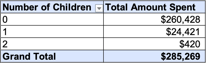
Our data shows a major gap—people without kids spend 10 times more on food delivery compared to those who have children.
This next chart displays the months in which customers joined DoorDash.
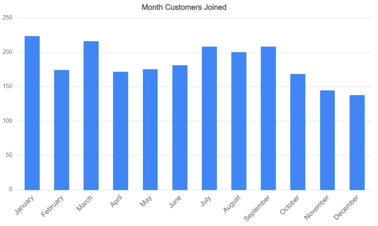
Sign-ups peak in January and March, while November and December see the fewest new users.
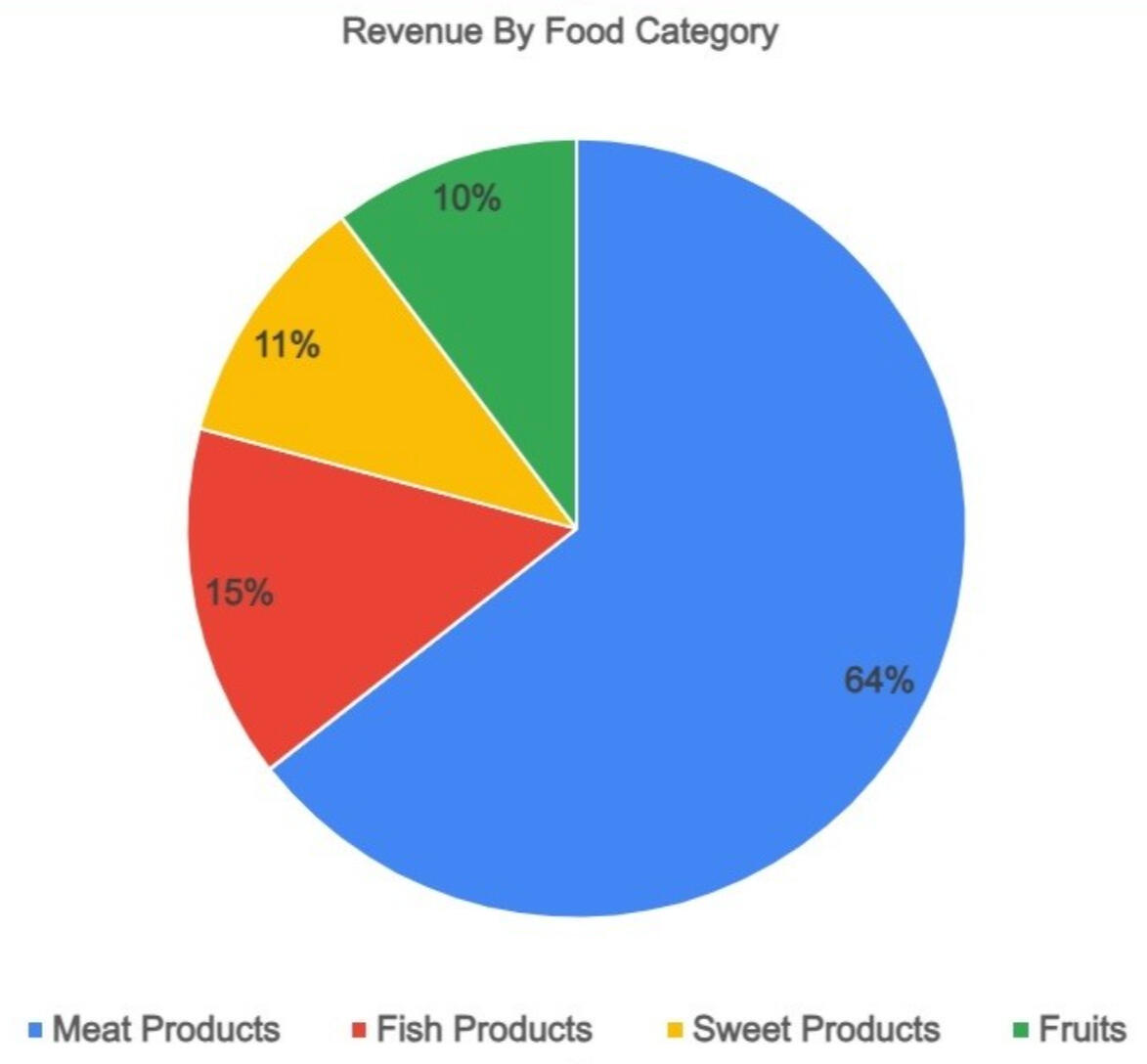
Next, this pie chart breaks down revenue by food category, highlighting the top-selling products. As you can see, meat stands out as the dominant category.
Finally, this scatterplot illustrates the correlation between income levels and total spending.
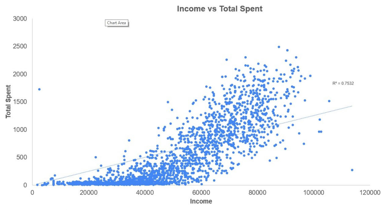
It reveals a strong correlation of 0.75 between income and how much customers spend. Higher earners tend to place larger or more frequent orders.
Strategic Insights
The patterns seen in Campaign 6 offer a solid foundation for better targeting future ad campaigns. Focusing efforts on the most engaged age and marital status groups could help drive loyalty and boost repeat business.A creative suggestion: run gift card promotions during the holiday season to increase engagement in slower months like November and December. These could be positioned as thoughtful, last-minute gift ideas.It’s also worth investigating why parents are spending less on delivery. While tighter budgets could be one reason, gathering more insights may help us tailor services and products to better suit this group’s needs.Since meat dishes are top performers, we should share this info with our restaurant partners. By adding or promoting more meat-based items, they may see a bump in sales, and it gives users another reason to order via DoorDash.Lastly, with such a strong link between income and spending, we can assume many of our users are value-conscious. This opens the door for new features like opt-in notifications for flash sales and promotions that help restaurants quickly move inventory, especially near-expiration items.
Interested in more projects like this? Check out the rest of my portfolio to see how I turn data into actionable insights across different industries.
🏫 Evaluating School Success with Tableau
Did you know there are nearly one million high school students in Massachusetts? That’s right—953,748 students, which is about one-seventh of the entire state’s population of 6.985 million. So, when it comes to high school education, we're talking about decisions that impact a huge number of lives.
The Backstory
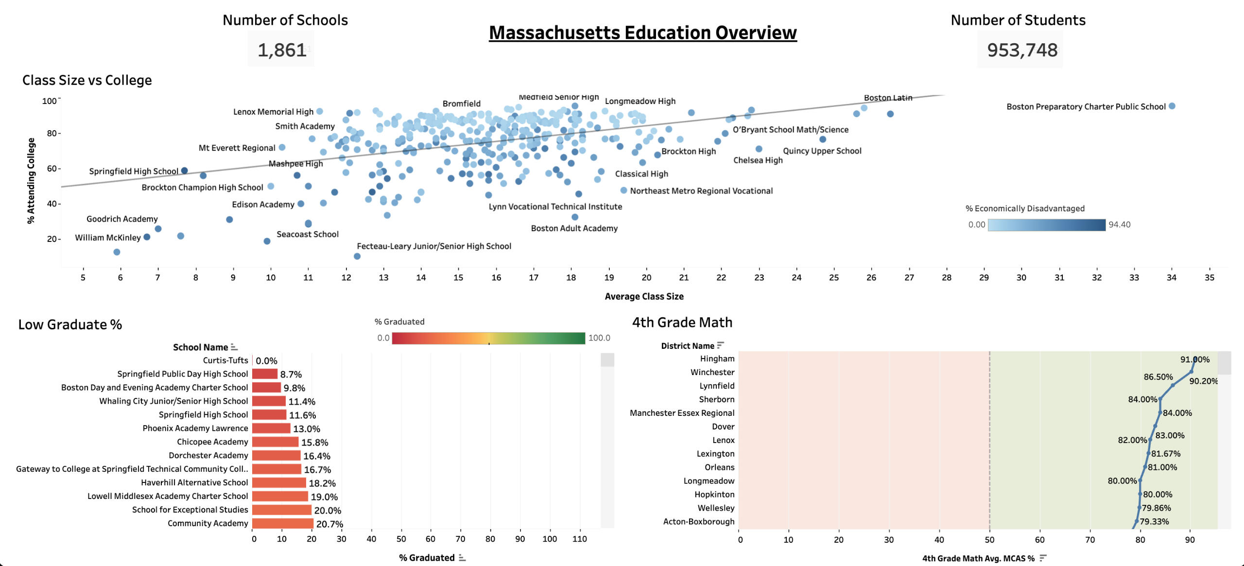
The Massachusetts Secretary of Education is on a mission to boost college attendance. One potential strategy on the table? Building more schools to reduce class sizes. To help explore that idea (and more!), we used Tableau to analyze education data across the state.Curious to check out the data yourself?
👉 View the Tableau Dashboard
What We Found
To start, I was surprised to learn that in the past year:162,137 students did not graduate, while 791,610 students did.Of those who graduated, 205,818 did not go to college, but 585,791 did continue their education.Naturally, we wondered: could class size be playing a role here?Well, the statewide average class size is 18, but interestingly, the top five performing schools actually have larger class sizes. So, class size alone doesn’t seem to tell the full story.
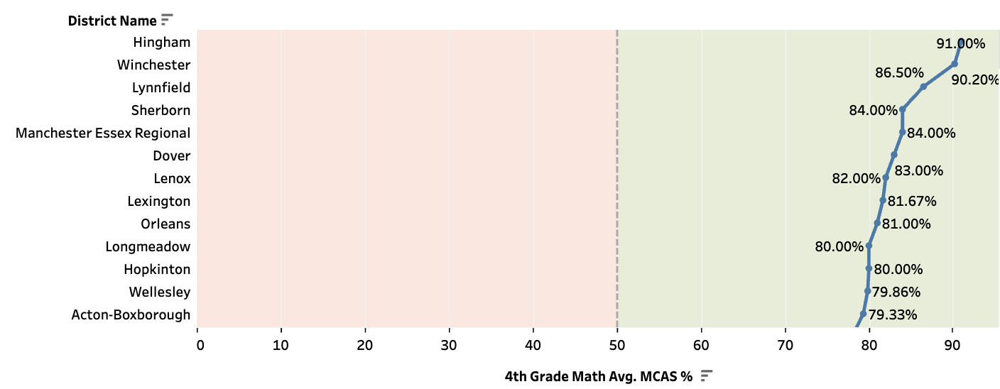
Who’s Crushing It (And How Can They Help?)
Some schools are seriously leading the charge, especially in 4th-grade math. Shoutout to:• Hingham
• Winchester
• Lynnfield
• Sherborn
• ManchesterThese schools could be key players in helping others level up. It’s worth reaching out to learn about the practices that are helping their students thrive.
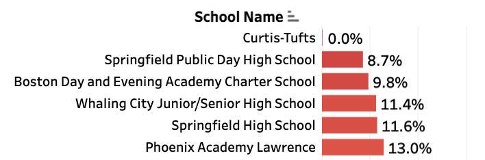
Schools That Need a Hand
On the flip side, a few schools are facing real challenges when it comes to GPA:• Springfield Public
• Boston Charter
• Whaling City Junior
• Springfield High
• Phoenix AcademyThese schools could really benefit from targeted support, and they’re a great starting point for new initiatives.
The Big Insight
Here’s what really stood out:In struggling schools, 77% of students are economically disadvantaged. Meanwhile, in the top-performing schools, only 13% face similar challenges. That’s a big gap—and it tells us that economic barriers are playing a major role in academic outcomes.
Recommendations
Partner with top-performing schools to share their successful strategies with others.
Focus funding on programs that support economically disadvantaged students instead of just building more schools.
Collaborate with colleges to strengthen the high school-to-college transition.
Thanks for reading to the end! Check out the rest of my portfolio for more data-driven insights.
🇪🇹 Funding Ethiopia’s Future: A Deep Dive into IDA Support with SQL
Introduction
When it comes to international development, Ethiopia has been a country to watch. From massive safety net programs to infrastructure upgrades, Ethiopia’s growth story has been fueled by partnerships — and none more prominent than the support from the International Development Association (IDA), the World Bank’s fund for the world’s poorest countries.Curious about just how much help Ethiopia has received — and where that money has gone — I turned to SQL to do some digging. Along the way, I uncovered billions in funding, major project wins, a few hiccups, and a whole lot of data worth sharing.Let’s take a look!
About the Dataset
The data for this project comes straight from the World Bank Group Finances website (last updated December 2022). It includes over a million rows covering loans, grants, and funding arrangements for countries around the world.For this analysis, I narrowed the focus exclusively to Ethiopia. Key columns included:• Country
• Project Name
• Original Principal Amount
• Cancelled Amount
• Disbursed and Repaid Amounts
• Key Dates (signings, disbursements, repayments)
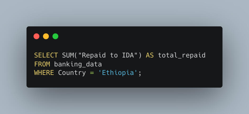
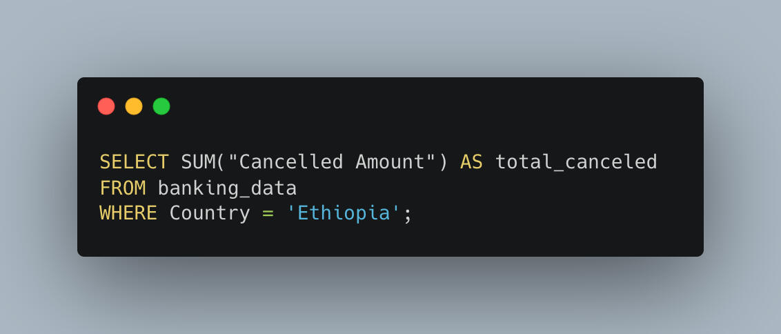
SQL Analysis
Each banking question I asked was answered the old-fashioned way: by writing SQL queries, reviewing the results, and connecting the dots.I included SQL code snippets and query result screenshots so readers can see the process step-by-step — and even replicate it if they want to.
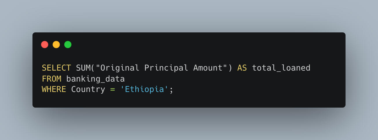
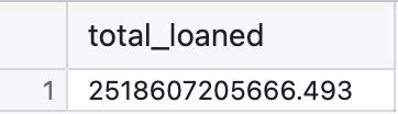
1. Total Funding Extended to Ethiopia
First question: How much has the IDA invested in Ethiopia over the years?The answer — brace yourself — is:$2,518,607,205,666.49That’s over two and a half trillion dollars! Ethiopia has clearly been a major priority in the IDA’s mission.
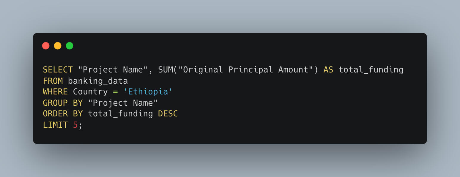
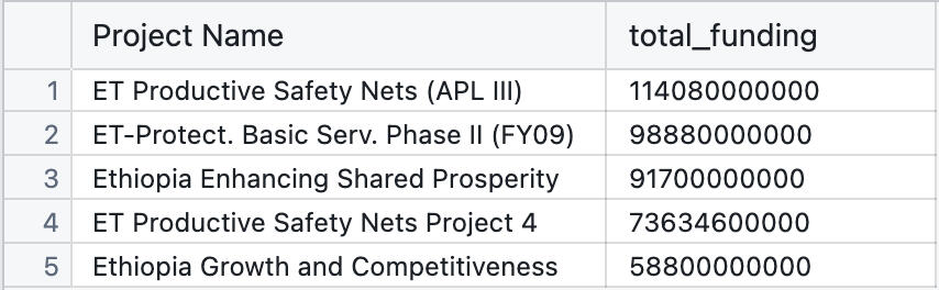
2. Ethiopia’s Top 5 Funded Projects
When it comes to where the money went, here are Ethiopia’s biggest-ticket projects:
| Project Name | Amount Funded |
|---|---|
| ET Productive Safety Nets (APL III) | $114,080,000,000 |
| ET-Protect. Basic Serv. Phase II (FY09) | $98,880,000,000 |
| Ethiopia Enhancing Shared Prosperity | $91,700,000,000 |
| ET Productive Safety Nets Project 4 | $73,634,600,000 |
| Ethiopia Growth and Competitiveness | $58,800,000,000 |
It's clear that social protection and economic competitiveness have been Ethiopia’s main development themes.
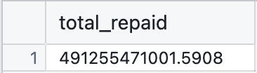
3. How Much Ethiopia Has Paid Back
Development loans are serious business — and Ethiopia has been diligently paying its dues.As of the latest data:$491,255,471,001.59 has been repaid to the IDA.This is a strong signal of fiscal responsibility and continued cooperation with international partners.
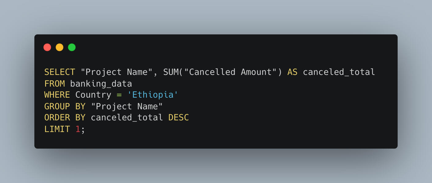
4. Project Cancellations and Surprises
Of course, not every project goes according to plan.Total canceled funds: $115,704,800,392.02Most canceled project:
ET-Energy Access SIL (FY03) with $19,916,734,556.35 canceled.Energy infrastructure, with all its moving parts, often brings unexpected challenges — and this project seems to have felt the brunt of that.
Takeaways
This journey through Ethiopia’s IDA funding tells a story of ambition, resilience, and real-world complexity. Some key lessons:
Ethiopia has been one of the largest recipients of IDA support worldwide.
Priority areas include strengthening safety nets and boosting competitiveness.
Despite economic challenges, repayment levels are impressive.
Flexibility is key in global development — cancellations happen, and learning from them is part of the growth.
Final Thoughts
As someone from Eritrea, a neighbor to Ethiopia, this project connected to me on a personal level. Behind all the numbers are communities, families, and futures that international development seeks to support.SQL helped me tell that story — one query at a time.Thanks for coming along on the journey!
🔨 Beneath the Surface: Analyzing Mining Operations with Python
Introduction
Have you ever wondered what really goes on beneath the surface in a mining operation? I did—especially when I was asked to investigate unexpected behavior at a flotation plant. The spotlight was on June 1, 2017, a date that raised concerns due to unusual operational patterns. My role as a data analyst was to explore the data surrounding that day and uncover any hidden insights. Using Python, I dove deep into the numbers to uncover what was—or wasn’t—going wrong.
Why This Project?
This analysis was driven by a specific concern: the mining company had flagged June 1 as a potentially problematic day. The question was simple—what caused the abnormal behavior?—but the answer required digging through thousands of rows of operational data. As someone passionate about data-driven problem solving, I was excited to take on the challenge and contribute to improving industrial efficiency through smart analytics.
What Readers Will Gain
In this write-up, I’ll walk you through the journey: from data cleaning and transformation, to visualization and interpretation. Whether you're new to mining data or an experienced analyst, you'll get a clear picture of:- How I approached the investigation
- What the data revealed
- And what surprised me along the way
Key Takeaways
- No distinct anomalies were found on June 1, 2017.
- A clear inverse relationship exists between % Iron Concentrate and % Silica Concentrate.
- Ore pulp pH values remained stable, most frequently between 9.9 and 10.1.
- Surprisingly, no strong correlations were found among the key variables—implying external or untracked factors may be at play.
Dataset Details
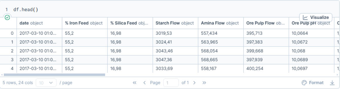
The dataset, publicly available on Kaggle, includes 737,454 rows and 24 variables, covering the period from March to September 2017. With data logged both hourly and by the minute, the level of detail was ideal for an in-depth operational review of the flotation plant.
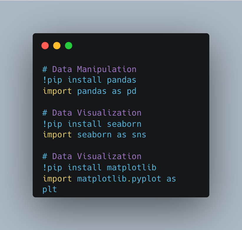
Library Installation
I performed the analysis in Deepnote, a collaborative browser-based IDE well-suited for exploratory data work.
Here are the key Python libraries I used:- Pandas for data manipulation
- Seaborn and Matplotlib for visualizations
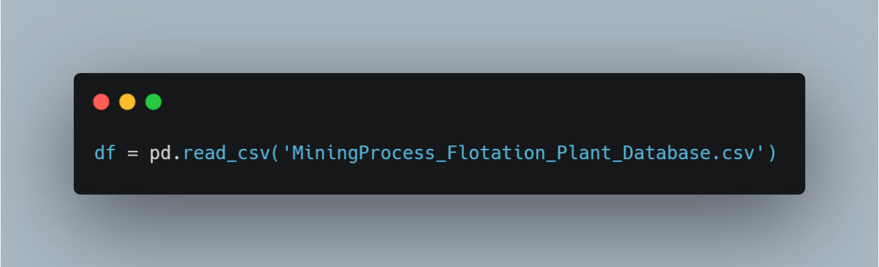
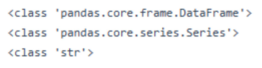
Next, I imported the dataset into a Pandas DataFrame and reviewed the structure to ensure the expected format and completeness.
↓ Connecting dataset to Python ↓
↓ Preview of dataset ↓
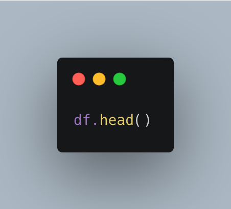
↓ Dataset preview result ↓
Analysis Process
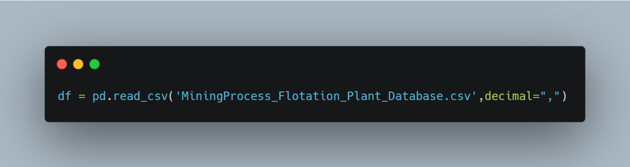
The first step was data cleaning. Some numerical values used commas instead of periods for decimal notation, which needed correction. I made those changes using the following code:
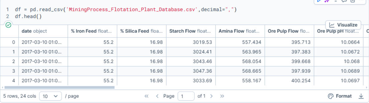
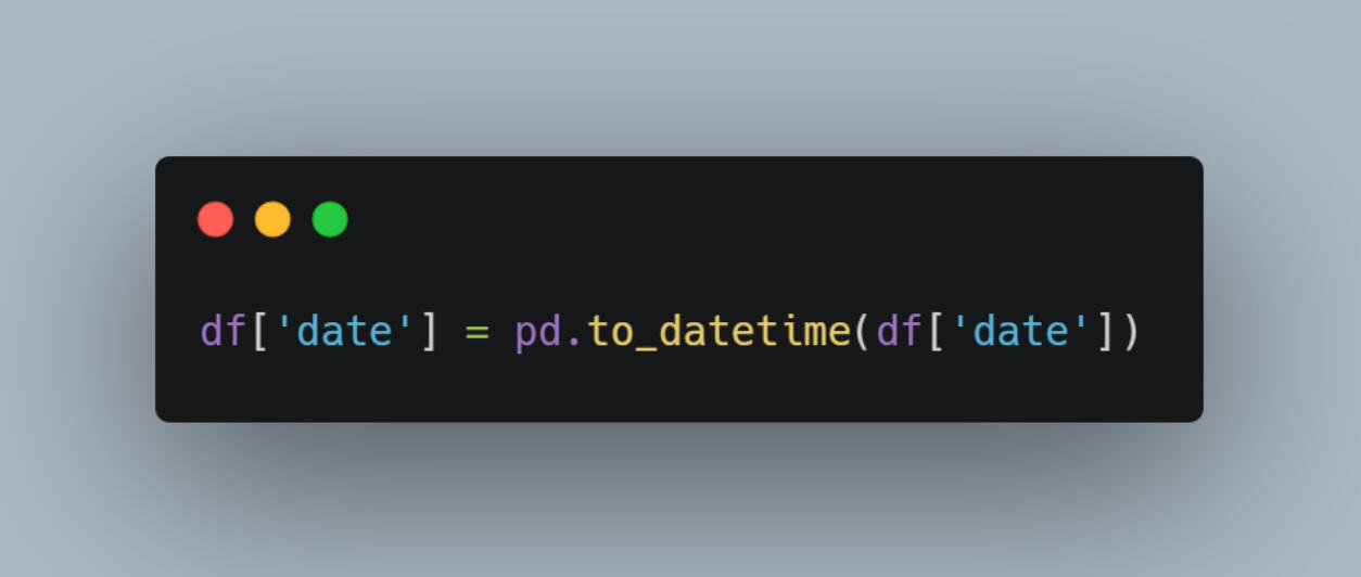
Next, I verified and corrected the data types of relevant columns.
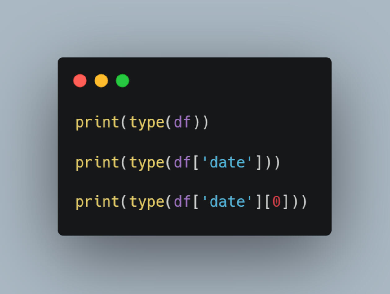
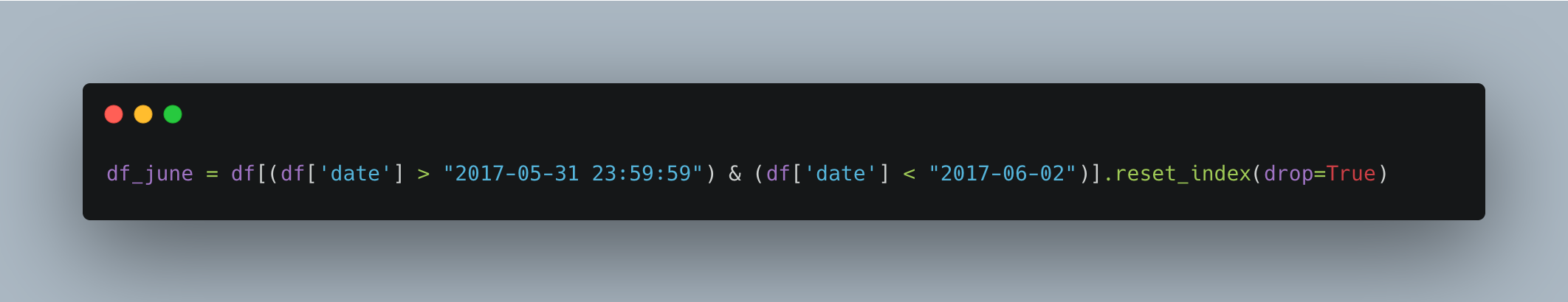
The date column was imported as a string, so I used the to_datetime() function in Pandas to convert it to a datetime format for proper filtering.
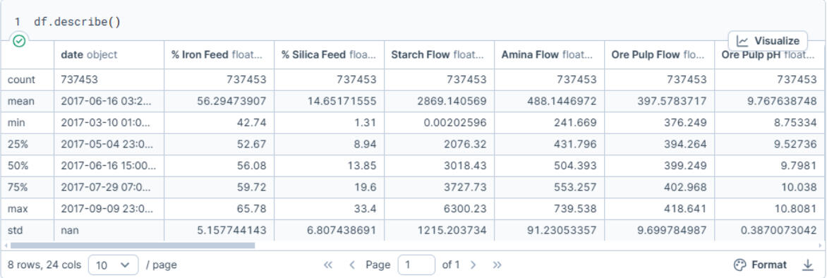
Once the data was cleaned and structured correctly, I generated summary statistics to understand the general distribution of variables such as % Iron Concentrate, % Silica Concentrate, and ore pulp pH.
Were There Any Anomalies on June 1, 2017?
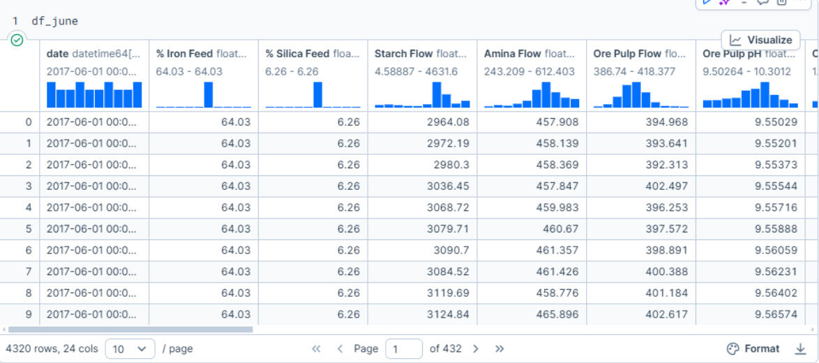
To investigate June 1, I filtered the data to focus on the first week of June and created a new DataFrame called df_june. This helped isolate any abnormalities in the period surrounding the flagged date.
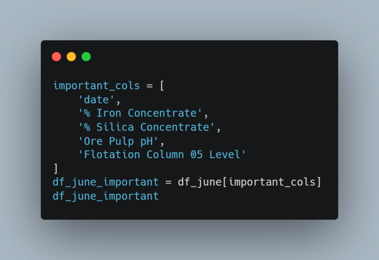
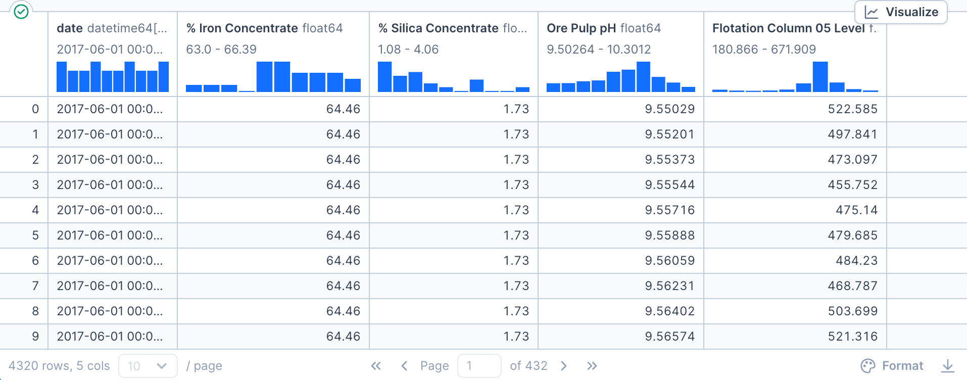
I then narrowed the focus further by creating df_june_important, a subset of columns deemed most relevant for operational insights:- Date
- % Iron Concentrate
- % Silica Concentrate
- Ore pulp pH
- Flotation Column 05 Level
Visual Exploration
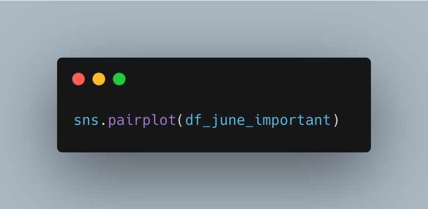
Using Seaborn’s pairplot, I visualized potential relationships between the selected variables.
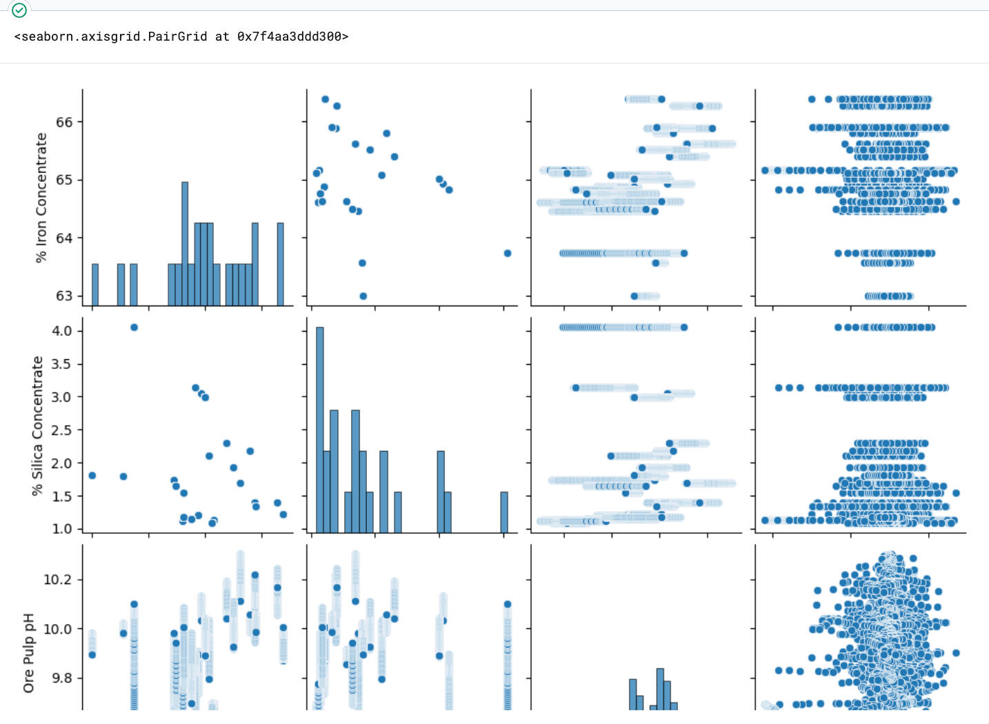
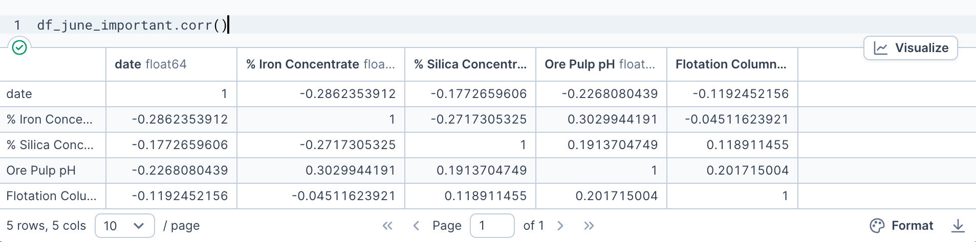
The result? Surprisingly weak correlations. Visually, it appeared that most variables operated independently of one another.To confirm this observation, I generated a correlation matrix, which showed low correlation coefficients across the board—highlighting that external, unmeasured variables may have influenced operations.
Fluctuations in % Iron Concentrate, % Silica Concentrate, Flotation Column 05 Level
Management requested a closer look at how certain metrics behaved throughout June 1. I created line plots with Seaborn to track fluctuations in concentration levels over the course of the day.- Flotation Column 05 Level exhibited a sharp drop at 3 p.m.
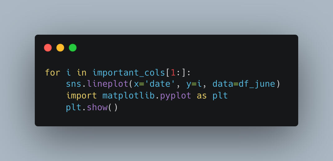
% Iron Concentrate showed variation around 11 a.m., a potential clue into mid-morning process changes.
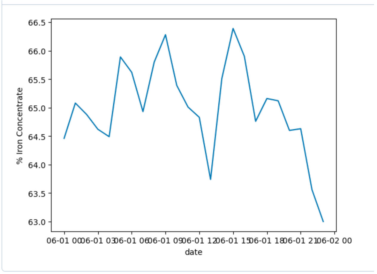
% Silica Concentrate had noticeable spikes at 5 a.m., 11 a.m., and 6 p.m.
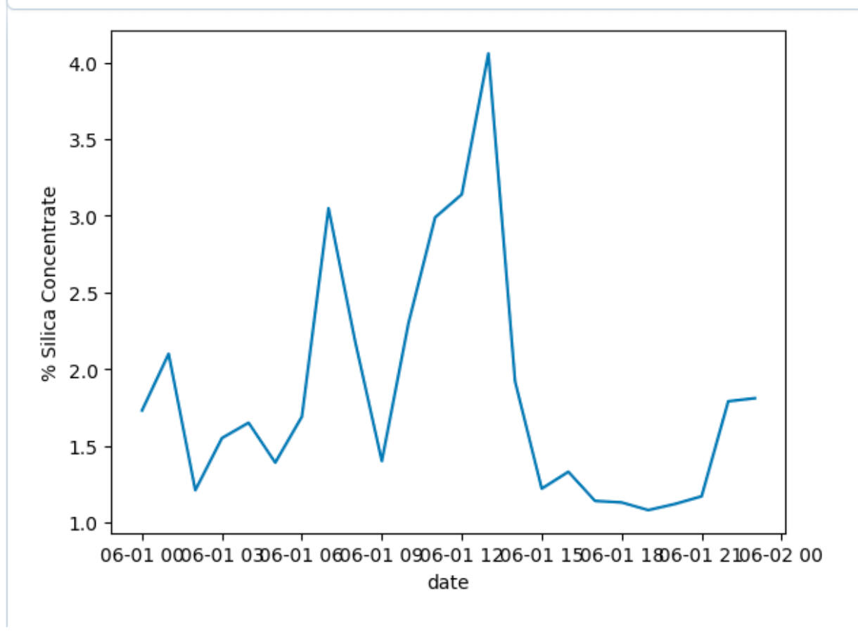
Flotation Column 05 Level exhibited a sharp drop at 3 p.m.
Main Takeaways
Reflecting on the project, several important lessons stand out:- Data preparation is essential—even small formatting inconsistencies can disrupt an entire analysis.
- Statistical summaries and visualizations are vital for spotting trends and gaining context quickly.
- Lack of correlation can be just as insightful—it signals where further investigation or additional data sources may be needed.
Conclusion and Personal Reflections
This project was an excellent example of how data analytics can be applied to real-world industrial challenges. Though we didn’t uncover a smoking gun on June 1, the process highlighted the complexity of mining operations and the value of granular data in uncovering operational insights.It also reminded me that sometimes, the real takeaway is not in the obvious patterns, but in the questions the data leads us to ask next.
Thanks for reading! If you’d like to see more of my work, explore the rest of my portfolio.